 Add Row
  Add
Add 


Unlocking the Beauty of the Golden Ratio in Your Designs
Are you grappling with a design that just doesn’t feel right? You’ve tweaked margins, adjusted padding, but something intangible remains off. This could be a classic design oversight: the golden ratio. The golden ratio, a mathematical principle approximately equal to 1.618, has defined beauty in art, architecture, and design for centuries. From the Parthenon in Athens to contemporary web pages, this proportion guides our visual preferences, suggesting balance and harmony. Understanding and applying this ratio in your work can elevate your designs, ensuring they hit that sweet spot of visual appeal. Let's delve deeper into this principle and how modern tools can help implement it effortlessly.Why the Golden Ratio Matters: A Journey Through Time
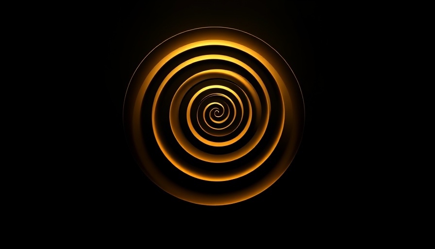
The golden ratio has withstood the test of time. Used by the ancient Greeks, it’s often referred to as the “divine proportion,” epitomizing what many consider a standard for beauty. Not just a relic of the past, this ratio permeates various elements of nature and human design—from the spirals in sunflower seeds to the dimensions of the human face. Why does it matter? Recognizing and utilizing the golden ratio makes your designs inherently pleasing to the eye, providing an intuitive guideline for artists and designers alike.Feeling Off? Discover Why Ratios Matter
Have you ever encountered a design that looks almost right but still feels unbalanced? The culprit could be an unconsidered ratio. Incorrect proportions can sabotage user experience, causing discomfort in navigation and interaction with your design. By visualizing the elements within the framework of the golden ratio, you enhance both usability and aesthetic value, aligning user experience with harmonic design principles.How to Calculate and Use the Golden Ratio
Calculating the golden ratio can appear daunting, but understanding its basic principle can simplify the process. You often see it articulated through the Fibonacci sequence, where each number is the sum of the two preceding ones. As you divvy up a design using these sequences, ratios naturally emerge, guiding your design's visual flow.Common Pitfalls When Applying the Golden Ratio
One prevalent mistake designers make is overlooking the golden ratios altogether or misapplying it. Many page builders ignore this classic principle because of the challenges in calculation and application. This neglect can lead to designs that are out of sync with current aesthetic standards. As a designer, being aware of these pitfalls allows you to avoid them and produce better work.Enhancing Design with Divi 5: A User-Friendly Approach
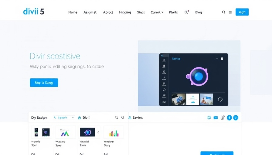
With the advent of page builders like Divi 5, applying the golden ratio becomes a straightforward task—freeing designers from complex calculations. Divi 5 streamlines the process, enabling you to focus on creating appealing layouts with perfect proportions simply by selecting ratios instead of calculating them.When using Divi 5, start with its pre-set layout options that integrate golden ratio measurements, ensuring your design is not only visually appealing but functionally efficient. Experience how easy beautiful design can be when powered by intelligent tools that anticipate your needs.
Making the Shift to Beautifully Balanced Design
By understanding the historical and mathematical significance of the golden ratio, designers can create more engaging spaces that resonate with audiences. An awareness of this ratio equips today’s designers with a tool that enhances their craft, creating experiences that feel natural and are pleasing to engage with. To explore more about effective design in the WordPress ecosystem, remember: the golden ratio isn’t just a number; it’s a principle that can elevate your work and provide clarity and balance to your web presence.Final Thought: Take advantage of the powerful tools available, like Divi 5, to harness the golden ratio in your designs and witness the difference in user experience.


 Add Row
  Add
Add 
Write A Comment