 Add Row
  Add
Add 


Unlocking the Power of HSL in Divi 5
With the impending launch of Divi 5, WordPress users are in for a treat with new features that promise to enhance their design experience. The latest feature to be unveiled is Relative Colors With HSL, a powerful addition aimed at asset optimization and superior design flexibility. But what does this really mean for web designers and developers?
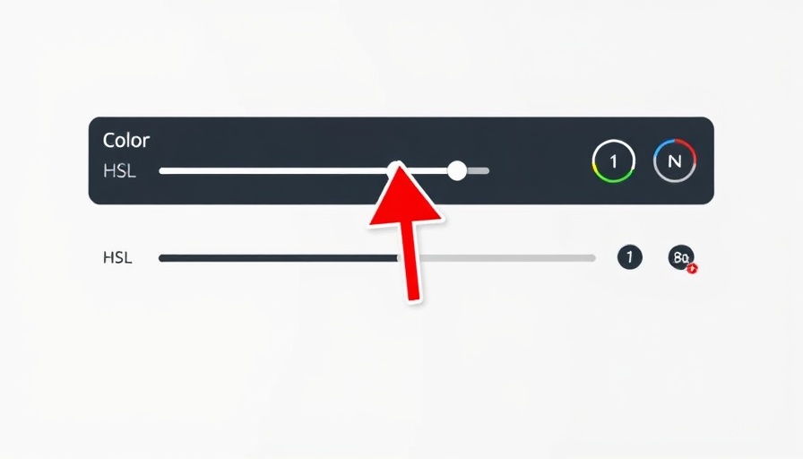
Understanding HSL: Hue, Saturation, and Lightness
HSL, which stands for Hue, Saturation, and Lightness, is a color representation model that allows greater precision and ease in color manipulation compared to traditional RGB values. Each aspect plays a critical role: Hue defines the actual color, Saturation controls the intensity of that color, and Lightness adjusts the brightness. For web designers, using HSL can mean the difference between a visually appealing site and a less professional one.
Why Relative Colors Matter
One of the concerns many designers face is maintaining color consistency across various elements of a website. Relative colors with HSL provide a solution by allowing designers to set colors in relation to each other rather than as absolute values. This means, for instance, adjusting one color could dynamically change the related tones throughout the design, ensuring harmony and coherence.
Real-World Applications of Relative Colors in Web Design
Imagine launching your new WordPress site with the perfect color scheme, but then you decide to tweak one aspect of your design. Without relative colors, you’d find yourself digging back through each module to ensure colors coordinate seamlessly. With the new feature in Divi 5, changes are no longer a headache. You can instantly see how adjusting a primary shade affects all secondary colors throughout your site with just a few clicks. This simplification can save designers countless hours and significantly improve workflow efficiency.
Comparative Insight: HSL vs. Traditional Color Models
Traditional RGB color manipulation can often be cumbersome and less intuitive, compelling designers to rely heavily on their visual judgment. HSL, conversely, fosters a more natural interaction and alignment with human perception of color, making it easier to adjust and find the perfect palette. By understanding the relative relationships between colors, designers can achieve more vibrant designs that resonate effectively with users.
Impact on Performance and Speed
As a performance expert, I can’t stress enough how crucial optimization is when designing WordPress sites. By using HSL for color adjustments, you can improve site-loading speeds since the CSS becomes less cluttered with duplicated color values. Not only will designers enjoy creative freedom, but they’ll also ensure that their selections contribute to overall performance, leading to a smoother user experience.
Looking to the Future: What This Means for Designers
As we eagerly await the official rollout of Divi 5 and its Relative Colors With HSL, the design landscape for WordPress sites is set to change dramatically. The approach presents new opportunities for innovation and creativity, empowering designers of all experience levels to enhance their craft. Notably, as color consistency and user experience become focal points in web design, embracing innovative tools like HSL can ensure you stay ahead in the competitive landscape.
So, as you anticipate the launch, consider how you’ll harness the power of HSL to create stunning, cohesive web designs that captivate your audience.
For those eager to explore more about how these features will evolve site design, stay tuned. The unveiling of Divi 5 promises to bring exciting developments that will equip you with the tools needed to elevate your WordPress projects to new heights.


 Add Row
  Add
Add 
Write A Comment